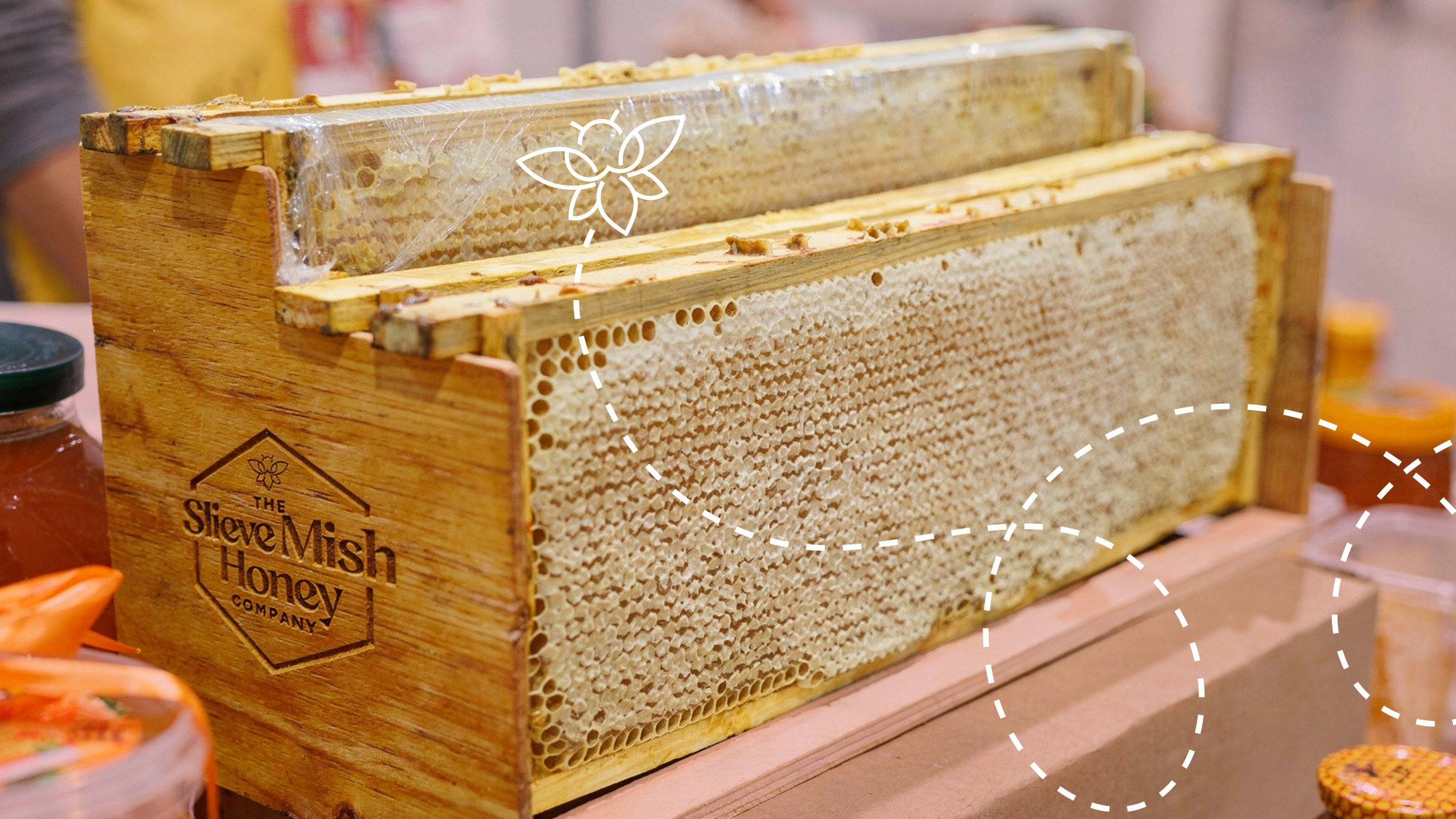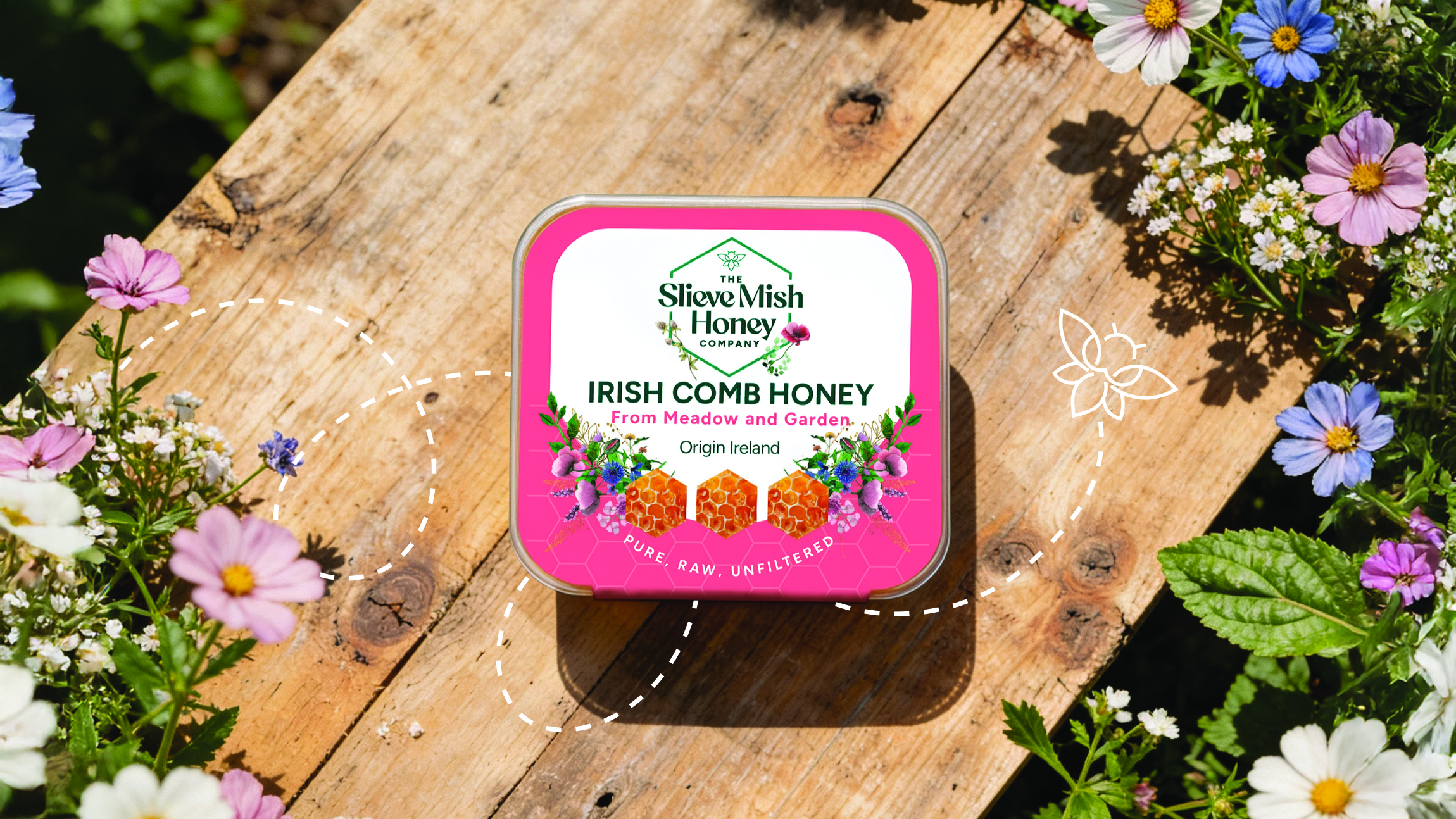
We started with a brand workshop to uncover what Slieve Mish truly stands for: its provenance, character, and the story behind the hives. It quickly became clear that the existing identity wasn’t strong enough to carry a retail product, so we refreshed it first and built the packaging on that stronger foundation.
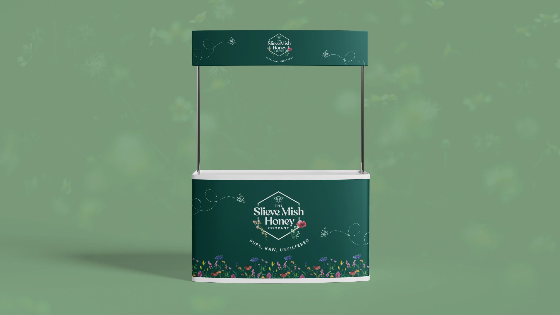
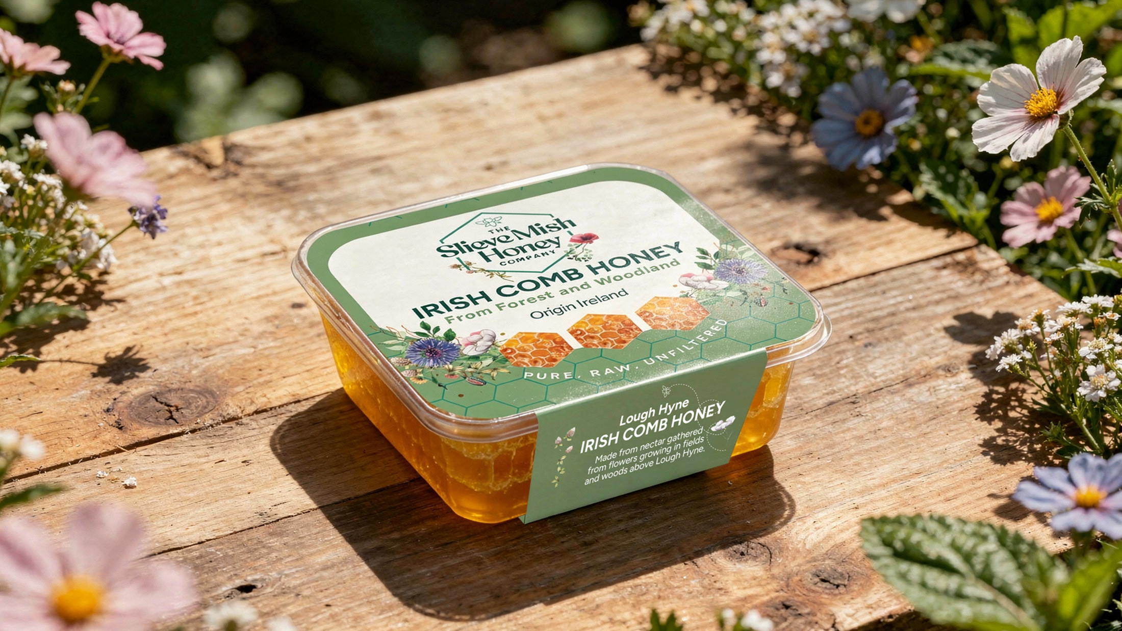
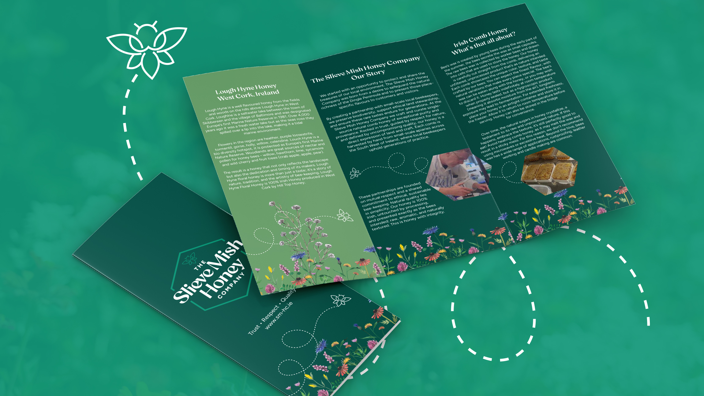
A key outcome was organising the offering into three ranges: Mountain, Forest & Woodland, and Meadow & Urban Garden Honeys, giving the brand structure and narrative depth. We then developed a consistent visual language, with distinct palettes for each range unified by a cohesive illustrative style that brought warmth and authenticity without feeling rustic.
We also researched suitable formats for Slieve Mish Honey’s specific packaging needs and connected Jonathan and Judi with packaging production professionals that could tailor packaging solutions that reflected our design strategies, and oversaw print production across two shelf ready products. Slieve Mish Honey Cut Comb is now proudly stocked on SuperValu Food Academy shelves, with a brand they can grow with confidence.