“For the average audience, the credits tell them there’s only three minutes left to eat popcorn. I take this ‘dead’ period and try to do more than simply get rid of names that filmgoers aren’t interested in. I aim to set up the audience for what’s coming; make them expectant.”— SAUL BASS
Personally I never thought much about the title sequence of a film growing up. This changed after watching Steven Spielberg’s “Catch Me If You Can” starring Leonardo DiCaprio. This title sequence “caught” me right from the beginning – pun intended! I was interested to find out more about the behind-the-scenes of the title sequence. I was interested in the style of the illustration, the simplicity of the colour palette, the way each frame flowed to the next, and the way the typography interacted with the illustration in such an idiosyncratic manner. I wasn’t hugely interested in the animation or technical side of how the title sequence was produced. I was intrigued to find out more about who created the artwork.
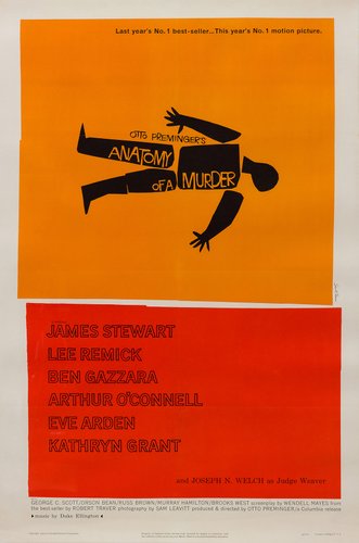
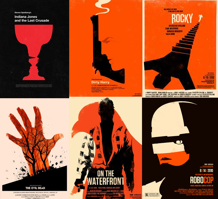
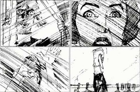
Paris-based animators Olivier Kuntzel, 41, and Florence Deygas, 37, created the look that suited the ’60s-set story. It took the pair months to press hundreds of ministamps of each character’s body parts onto paper, cut them out, and scan them to move along a computer-animated backdrop. They hadn’t seen the film before they started, they had read the book and decided on images from there. The title sequence was hugely influenced by Saul Bass (1920-1996). Saul Bass was a graphic designer, born in the Bronx who took his New York style to California and became famous for his work in film and classic logo design. He studied in New York at the Art Students’ League as a teenager and developed a unique style that is both recognisable and memorable. Bass is famous for his use of simple, geometric shapes and symbolism. Often, a single dominant image stands alone to deliver a powerful message. These shapes, as well as type, were often hand-drawn by Bass to create a casual appearance, always packed with a sophisticated message. His ability to create such a powerful message with basic shapes makes the work even more impressive. Bass’s illustrations captured the mood of a film with such simplicity in his shapes and images. Bass started designing film posters and then moved on to creating impressive title sequences for many classic films such as Psycho and Vertigo. One of my favourite films of all time is Alfred Hitchcock’s “Psycho”, and when I found out that Saul Bass storyboarded that famous shower scene my interest in him and his work grew even more. Bass also created the title sequence for Psycho. The title sequence is simple but so effective and sets the tone of the entire film.
As well as his involvement in film, Bass designed many iconic logos, some of which still exist today. Throughout his career Bass designed logos for companies such as AT&T, United Airlines, Quaker Oats, and Warner Communications. He also designed the poster for the 1984 Los Angeles Olympic Games in 1984 and several Academy Award shows. All in all, his work succeeded in capturing…with simple shapes and images, and his legacy lives on with many designers like Olly Moss still inspired by him.